
“Design isn’t just what it looks like; it’s how it works—and how it makes users feel! Let’s craft experiences that matter.”
Introduction:
Let’s be real—UX design and UI design are no longer optional; they’re the backbone of every successful digital product. In a world where users decide within seconds whether to stay or bounce, your product’s interface can either hook them or drive them away.
Ever ditched a clunky website or app because it made your life harder? Exactly. Now think of those sleek, intuitive designs you can’t get enough of—they’re not just pretty; they’re smart. That’s the power of exceptional UX/UI design.
In this blog, we’ll uncover:
- How UX/UI design impacts user engagement and usability
- The role of UX/UI in driving user satisfaction
- Expert tips for creating exceptional user experiences that dominate in 2025.
We’ll also throw in stats, actionable insights, and real-world examples to show you how to create designs that don’t just look good but feel right. Whether you’re crafting an app, revamping a website, or building the next big thing, this is your guide to boosting user satisfaction and retention with killer design.
Ready to turn your product into something users love (and rave about)? Let’s dive in!
Why Does UX/UI Design Matter?
Your users don’t give second chances—they form an opinion about your product in the blink of an eye. If you want to win them over (and keep them), UX design and UI design are your secret weapons. Let’s break it down with some jaw-dropping stats and actionable insights:
1. First Impressions Matter
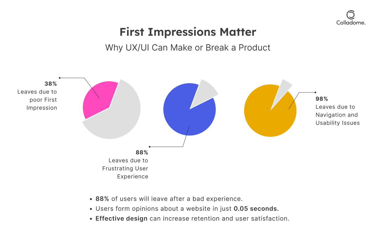
- It takes 0.05 seconds for users to judge your website or app. That’s faster than a blink! A clunky design? Instant bounce. A sleek, intuitive interface? They stay. (Source: Google Research)
- 88% of users won’t return after a poor UX experience. Translation: bad design doesn’t just cost you clicks—it costs you loyalty. (Source: Amazon Web Services)
Takeaway: In today’s fast-paced digital world, interface design isn’t just about looking good; it’s about making those critical first moments count. Think clean layouts, smooth navigation, and instant usability.
2. User Retention and Engagement
- A well-designed interface can boost user retention by 200% and increase engagement by 150%. That’s not just good—it’s game-changing. (Source: Forrester)
- How UX/UI design impacts user engagement and usability is simple: it eliminates frustration, minimizes learning curves, and creates a seamless journey.
Takeaway: Users don’t just want to visit—they want to stay, explore, and interact. Smart UX/UI makes them feel like the product was built just for them.
3. Competitive Advantage
- Companies that prioritize UX design outperform their competitors by 219% on the S&P index. (Source: Design Management Institute)
- The role of UX/UI in improving product interface and user satisfaction is no longer optional. It’s the differentiator that sets you apart in a crowded market.
Takeaway: Investing in top-tier UX/UI isn’t an expense—it’s a profit engine. Whether you’re a startup or an enterprise, great design doesn’t just attract users; it turns them into loyal advocates.
4. Best Practices for User Interface and Experience Design in 2025
- Future-proof your designs by focusing on adaptability, accessibility, and personalization.
- Use AI and data analytics to predict user behavior and deliver hyper-tailored experiences.
Final Thought: UX/UI design isn’t just about aesthetics—it’s about creating meaningful connections. The question isn’t if you should invest in UX/UI—it’s how much longer can you afford to wait?
What Is UX/UI Design?
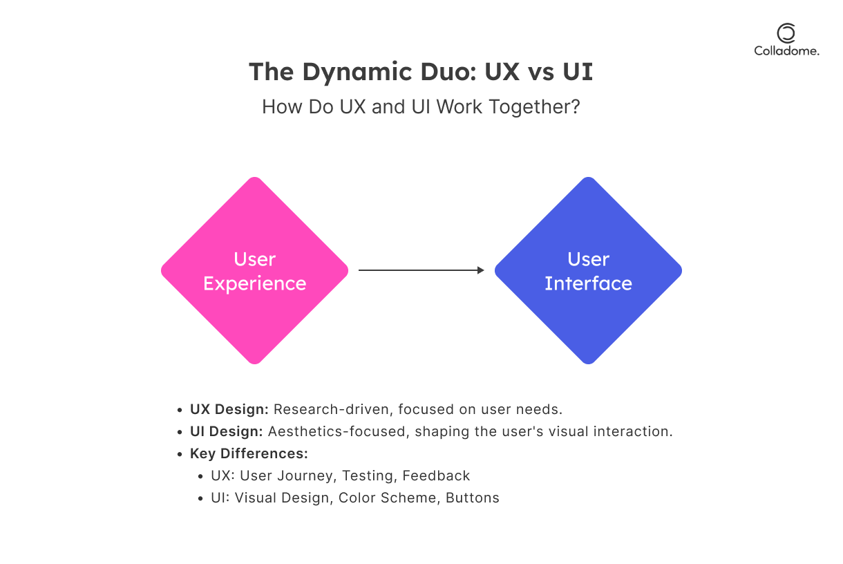
Let’s get one thing straight—UX design and UI design are NOT the same. They’re like the dynamic duo of product design: inseparable, yet playing very distinct roles. Together, they create magic—turning users into loyal fans and clicks into conversions. Here’s the lowdown:
User Experience (UX) Design: Engineering Seamless Journeys
UX design is all about the experience. Think of it as crafting a road trip—figuring out the route, stops, and ensuring the journey is as smooth as possible. The goal? Deliver meaningful, frustration-free, and delightful experiences tailored to what users need.
Definition:
UX design focuses on creating seamless and meaningful experiences by understanding user needs, behaviors, and emotions. It’s less about “how it looks” and more about “how it works.”
Key Components of Killer UX Design:
- User Research & Personas:
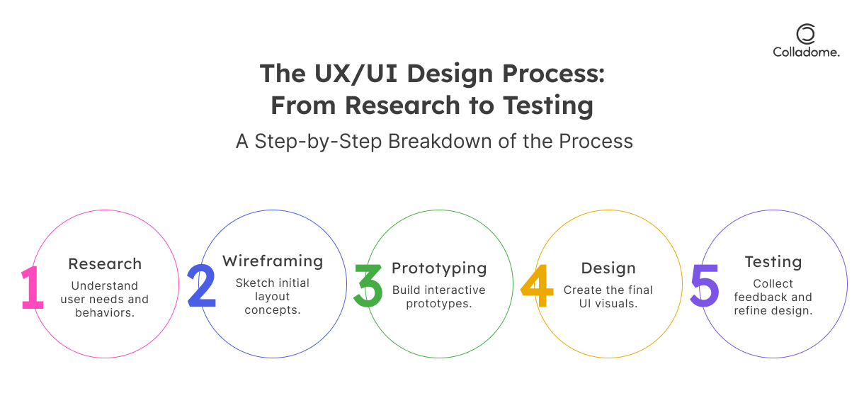
Start with understanding your audience. What do they love? What drives them mad? Personas are like character sketches of your users, helping you design with empathy. - Wireframing & Prototyping:
These are your blueprints—sketch out how each screen flows into the next. Prototypes let you test before you build. (Think of it as a “try before you buy” for ideas.) - Usability Testing & Feedback Loops:
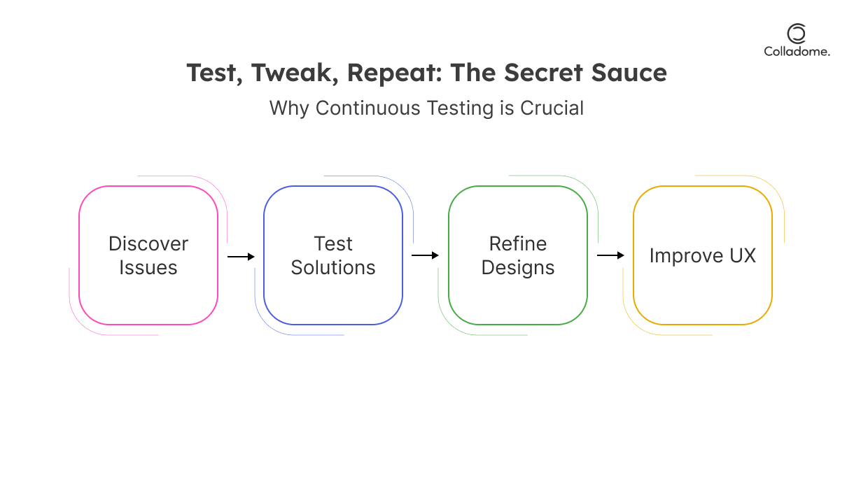
Test, tweak, repeat! UX design thrives on feedback. If your users hesitate or feel confused, your job isn’t done.
Expert Tip:
UX design impacts user engagement massively. A product that’s clunky to navigate is a one-way ticket to losing users. Test relentlessly to ensure your design speaks their language—not yours.
User Interface (UI) Design: Where Function Meets Fashion
Now let’s talk about UI design, aka the visual superstar of the duo. If UX is the road trip plan, UI is the shiny car that makes people want to jump in. It’s about taking the experience and making it look and feel AMAZING.
Definition:
UI design handles the visual and interactive elements of a product, ensuring it’s both functional and drop-dead gorgeous. It’s what your users see and touch.
Key Components of Irresistible UI Design:
- Typography & Color Schemes:
Fonts and colors aren’t just decoration—they’re tools to guide attention, evoke emotions, and boost usability. Want trust? Use blues. Want urgency? Use reds. - Interactive Elements:
Buttons, icons, sliders—they’re not just eye candy. They must function intuitively. (Pro tip: Make your call-to-action buttons impossible to miss!) - Consistent Design Patterns:
Consistency is king. Whether it’s buttons, menus, or pop-ups, your users should feel like they’re navigating one cohesive world—not bouncing between different ones.
Expert Tip:
UI isn’t just about aesthetics—it’s about interface usability. Great UI design minimizes friction, making users feel like everything is exactly where it’s supposed to be.
UX vs UI Design: The Ultimate Face-Off!
| Category | UX Design | UI Design |
| What’s the Big Idea? | Crafting seamless, frustration-free experiences. Think usability, logic, and flow. | Bringing the bling—it’s all about visual appeal and interactions that WOW! |
| Primary Goal | Make users shout, “This just WORKS!” (flawlessly). | Make users go, “OMG, this looks and feels amazing!” |
| Focus Area | User journey—every touchpoint, every step. | User interface—colors, typography, buttons, icons, and all the snazzy details. |
| Core Components | User research, wireframes, usability testing, feedback loops. | Typography, color schemes, interactive elements, consistent design patterns. |
| Think Like a… | Psychologist: What’s the user thinking? Feeling? | Artist: What’s gonna dazzle their eyes and keep them hooked? |
| Impact on Engagement | A killer UX boosts retention and satisfaction—users come back because it’s just THAT smooth. | A jaw-dropping UI hooks users immediately—because hey, first impressions really matter. |
| Common Pitfalls | Over-complicating flows, ignoring feedback, skipping user research. | Overloading with flashy elements, inconsistent design, sacrificing function for form. |
| Buzzwords You’ll Hear | Personas, user journey, usability testing, friction points. | Mood boards, typography, pixel-perfect, color psychology. |
| Best Use Case | Solving pain points for a long-term win. | Making your product shine for that instant “wow” factor. |
| Keyword Boost | Expert UX/UI design tips for creating exceptional user experiences. | Best practices for user interface and experience design in 2025. |
How to Design Exceptional UX/UI Like a Pro?
Here’s the secret sauce for creating unforgettable user experiences and stunning interfaces that scream success!
1. Know Thy Users Like a Stalker (in a good way!)
Your users are the north star of your design process. Without understanding their needs, you’re just guessing.
- What to Do:
- Conduct surveys, interviews, and deep-dive usability tests.
- Map out user personas—your hypothetical users with detailed behaviors, goals, and frustrations.
- Identify pain points and anticipate what makes them tick (or quit).
- Pro Tip:
If you don’t understand your audience, your competitors will. Tools like Typeform or Google Forms make collecting insights easy and fun.
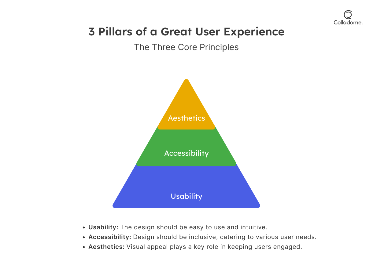
2. Accessibility Isn’t Optional—It’s Non-Negotiable
What’s the point of a killer design if some users can’t even access it? Make your UX/UI inclusive and user-friendly for all.
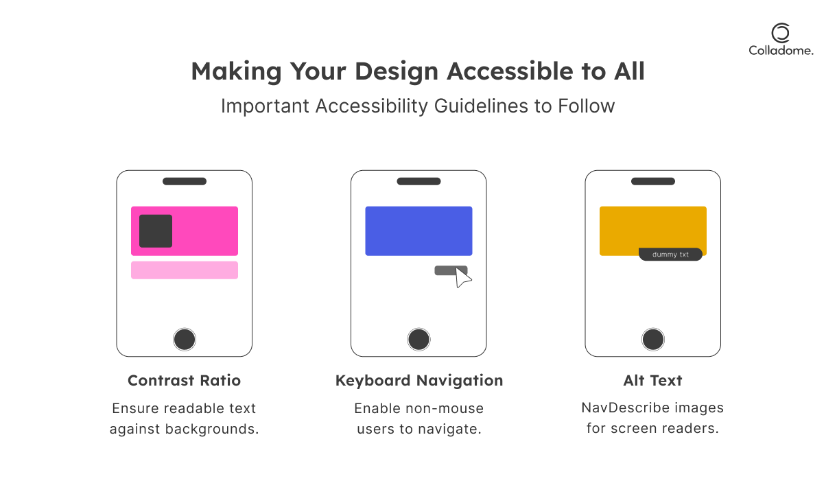
- What to Do:
- Follow WCAG (Web Content Accessibility Guidelines) to the letter. This includes features like alt text, keyboard navigation, and proper contrast ratios.
- Test accessibility using tools like WAVE or Axe—these identify accessibility issues you might overlook.
- Ensure your interface design supports assistive tech like screen readers.
- Pro Tip:
Accessible design isn’t just ethical; it’s a legal and financial win. Accessible websites rank better on Google (hello, SEO boost!).
3. Prioritize Mobile-First Design (Because Everyone’s Glued to Their Phones)
Your users are scrolling on their mobiles right now—don’t let them pinch, zoom, or rage-quit.
- Why It’s Crucial:
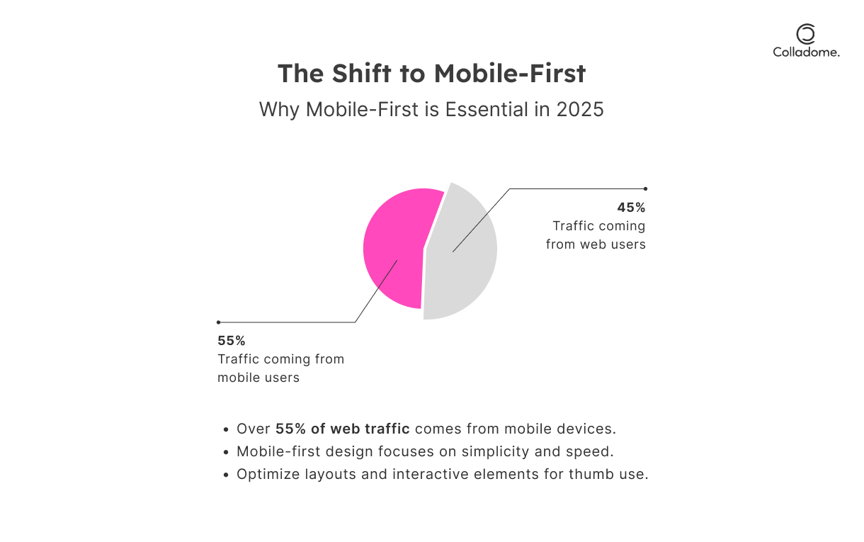
- Over 55% of web traffic comes from mobile devices (Source: Statista).
- A bad mobile interface? Say goodbye to retention and engagement.
- What to Do:
- Start designing for smaller screens first—mobile-first design is the gold standard in 2025’s UX/UI trends.
- Simplify layouts, minimize text, and make buttons big enough for thumb-tapping superheroes.
- Test across devices—use tools like BrowserStack to see how your design works on all screen sizes.
- Pro Tip:
Think of your mobile design as Netflix—clean, fast, and easy to navigate with one thumb.
4. Master the Art of Visual Hierarchy (A.K.A. The “Look Here First” Trick)
Your users aren’t Sherlock Holmes—they won’t spend hours figuring out your interface.
- What to Do:
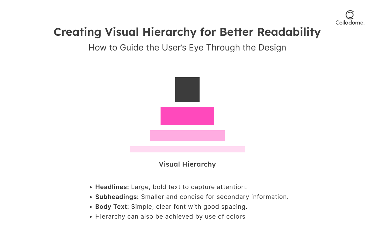
- Put critical elements (like CTAs) where users naturally look—think F-patterns and Z-patterns.
- Use bold contrast, intuitive spacing, and clear fonts to guide attention.
- Prioritize readability—too much clutter? Kill it with white space.
- Why It Matters:
Great interface design isn’t about making things pretty—it’s about making information effortless to digest. - Pro Tip:
Use tools like Figma or Adobe XD to prototype your layout and test visual flow before going live.
5. Iterate Like Your Design Depends on It (Because It Does)
If you think your first design is perfect, you’re wrong. The best UX/UI designs evolve constantly.
- What to Do:
- Gather real-time feedback with tools like Hotjar or Crazy Egg—watch where users click, scroll, or get stuck.
- Run A/B tests for critical components like buttons or navigation menus.
- Roll out small, iterative updates based on actual user behavior.
- Pro Tip:
Your user experience isn’t “done” just because you launched. Great designs are living, breathing things that grow with user expectations.
Real-Time Examples: UX/UI Design in Action
Let’s take a quick dive into real-world examples where UX/UI design isn’t just an afterthought—it’s a game-changer. Here’s how companies are killing it with their interface design and user experience strategies:
India:
-
Zomato’s Seamless UX:
- What They Do Right:
Zomato’s interface is all about simplicity and usability. They nailed minimalist design—no distractions, just intuitive navigation that takes you from craving to ordering in mere seconds.- Why It Works:
Zomato personalizes recommendations based on user history, making the experience feel tailored to your tastes. Whether you’re looking for a quick snack or planning a feast, Zomato’s UX knows what you want before you do - Pro Tip: This is contextual UX at its best—designing based on what the user is likely to do next. Zomato’s interface encourages continuous interaction by anticipating needs and delivering the most relevant info instantly.
- Why It Works:
- What They Do Right:
-
Paytm’s User-Centric Design:
- What They Do Right:
Paytm offers a consistent UI that spans across multiple services—payments, bookings, investments, and more. From top to bottom, the app exudes clarity and ease of use.- Why It Works:
Paytm’s interface design ensures that users never feel lost. Whether you’re paying bills, checking balances, or booking tickets, the layout stays familiar and responsive. - Pro Tip: Consistency is key. By maintaining the same design language across multiple features, Paytm makes it easy to transition between tasks without losing momentum.
- Why It Works:
- What They Do Right:
Worldwide:
-
Spotify’s Intuitive Experience:
- What They Do Right:
Spotify’s design isn’t just user-friendly—it’s smart. Through AI-powered recommendations, Spotify tailors music suggestions to individual preferences, ensuring users stay engaged and satisfied.- Why It Works:
The user experience feels alive, evolving based on what you listen to and when you listen to it. Personalized playlists, album suggestions, and even podcast recommendations are all served with seamless, effortless UX/UI. - Pro Tip: The secret sauce? Personalization—Spotify’s design encourages users to explore while predicting what they’ll love next. This level of tailored UX/UI keeps users coming back, without even thinking about it.
- Why It Works:
- What They Do Right:
-
Apple’s Iconic Design:
- What They Do Right:
Apple is practically synonymous with good design. Every product, from the iPhone to the MacBook, is ergonomically and aesthetically flawless. It’s not just about looks; Apple’s products are built for usability and comfort, with intuitive touchpoints that feel natural.- Why It Works:
Apple doesn’t just design products; they design experiences. Their attention to visual design and user flow ensures that even the most complex tasks become simple and accessible. - Pro Tip: Apple’s interface design revolves around seamlessness. Every action, from unlocking your phone to switching apps, feels effortless and deliberate. This flow keeps users in a constant state of satisfaction.
- Why It Works:
- What They Do Right:
Statistics
- Market Growth: The UX/UI design market is projected to reach $50 billion by 2030, growing at a CAGR of 15.4% . (source)
- ROI of UX Design: Every $1 invested in UX yields a return of $100. (source)
- User Expectations: 94% of first impressions are design-related. (source)
- Mobile Design Importance: 85% of users believe mobile sites should be as good or better than desktop versions. (source)
- Increased Conversion Rates: Improving UX/UI can boost conversion rates by 400% . (source)
Best Practices for UX/UI Design in 2025
Ready to crush it with your UX/UI design game in 2025? If you’re looking to level up your interface design and user experience, here’s a rundown of game-changing best practices to keep your users hooked and make your products unforgettable. Buckle up!
1. Leverage AI and Machine Learning for Predictive Design
- What’s the Magic?
AI is no longer a luxury—it’s a necessity. Use machine learning to analyze user behavior, predict actions, and personalize experiences in real-time.- Why It Works:
AI can instantly adapt your interface based on a user’s past actions, preferences, and even their mood (thanks to sentiment analysis). Whether it’s content recommendations or layout adjustments, AI makes your design smarter. - Pro Tip: Predictive design is about anticipating your users’ next move. Deliver tailored content, suggestions, and interactions that feel personalized—almost as if your app or website reads their mind.
- Why It Works:
2. Microinteractions: The Power of Subtle Animations
- What’s the Big Deal?
Microinteractions are the little animations or effects that happen when users interact with elements on your interface. Think hover effects, button animations, or that sweet little feedback when you like a post.- Why It Works:
These small, subtle cues give users instant feedback and enhance satisfaction by making them feel like they’re in control. Plus, they make your interface design feel more alive and engaging. - Pro Tip: Add microinteractions to guide users through actions. Button highlights, progress indicators, and swipe animations will make users feel effortlessly confident as they navigate your app or website.
- Why It Works:
3. Dark Mode: Because Not Everyone Likes Bright Lights
- Why Dark Mode?
With over 80% of users preferring dark mode, offering this design option isn’t just a nice-to-have—it’s essential.- Why It Works:
Dark mode isn’t just a visual preference—it’s comfort. It reduces eye strain, saves battery life, and makes your interface look sleek and modern. Users will appreciate your design’s ability to cater to their needs. - Pro Tip: Dark mode isn’t just about changing colors—consider how the layout, typography, and contrast interact with darker tones for maximum legibility and comfort.
- Why It Works:
4. Voice User Interfaces (VUIs): Hands-Free Navigation FTW
- Let’s Talk Voice
Voice User Interfaces (VUIs) are becoming super important for hands-free interactions. With the rise of Alexa, Google Assistant, and Siri, incorporating voice commands will make your product stand out in 2025.- Why It Works:
Voice interaction means users can engage with your product while cooking, driving, or doing literally anything else. It’s convenience at its peak. - Pro Tip: Integrate VUI smoothly into your app or site, using natural language processing to ensure commands are understood correctly. It’s time to go beyond typing—users want to control your product with their voice.
- Why It Works:
5. Sustainable Design: Save the Planet, One Pixel at a Time
- Eco-Friendly Interfaces? Yes, Please.
Sustainability is no longer just a buzzword; it’s a responsibility. Optimizing your UX/UI design for lower energy consumption isn’t just great for the planet—it’s also a smart move for long-term product viability.- Why It Works:
Eco-conscious users will notice your effort. Sustainable design means using lighter assets, optimizing code, and ensuring your design doesn’t overload devices or waste energy. The best part? This also leads to faster loading times and a smoother user experience. - Pro Tip: Reduce your design’s carbon footprint by optimizing image sizes, simplifying animations, and adopting green coding practices. It’s a win for both the planet and your users.
- Why It Works:
| Best Practices | Why You Need It | Pro Tip |
| AI & Machine Learning | Predict user behavior, personalize content & enhance UX design. | Let AI do the heavy lifting—designs that feel intuitive. |
| Microinteractions | Small animations that make users feel in control. | Engage users with subtle details that guide them along. |
| Dark Mode | Save eyes & battery life—users love it. | Give users the choice—switch between light and dark mode. |
| Voice User Interface (VUI) | Hands-free controls, making navigation easy as saying ‘Hey Siri’. | Get ahead of the game by adding voice control for ease. |
| Sustainable Design | Because green is the new black—optimize designs for energy-saving. | Reduce energy consumption without compromising user experience. |
Conclusion
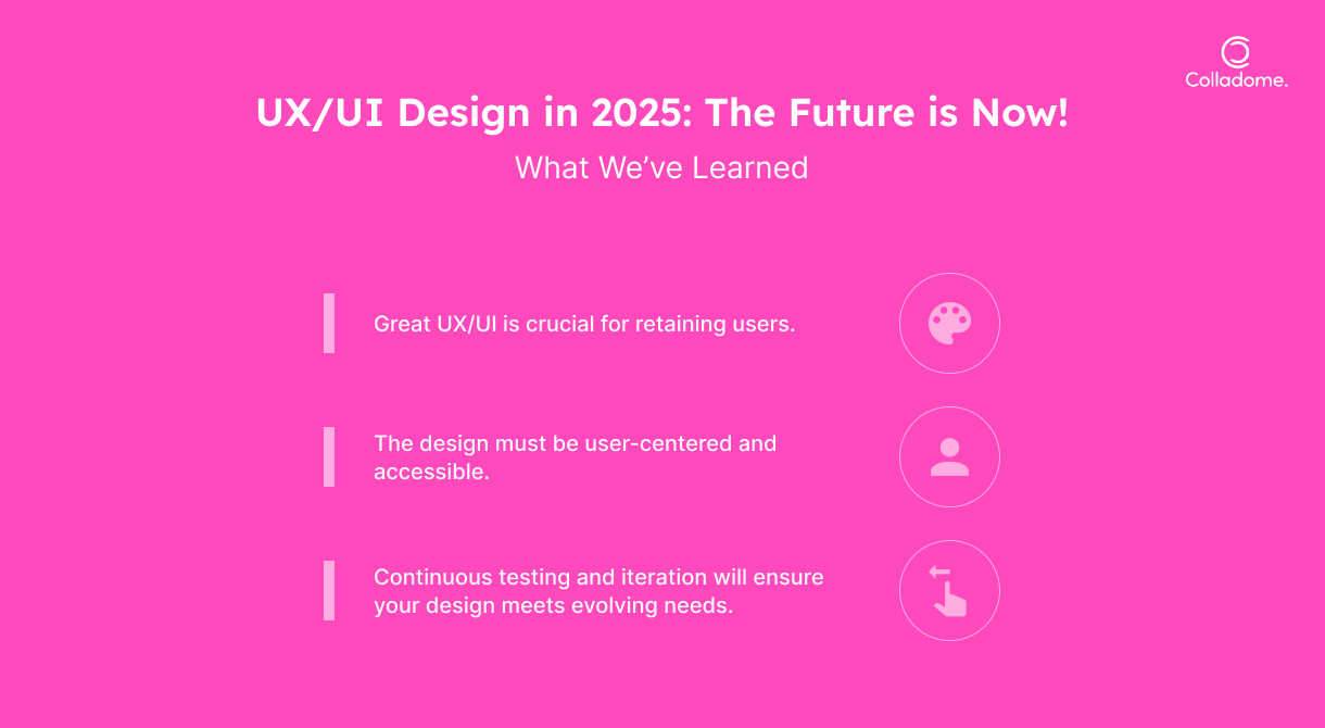
Let’s face it—exceptional UX/UI design is no longer just a “nice-to-have”; it’s a full-blown business necessity. A stunning interface might catch a user’s attention, but it’s the seamless user experience that keeps them hooked. Whether you’re building for a global audience or a hyper-specific niche, focusing on interface design and user satisfaction is the ultimate power move in today’s digital-first world.
Great design isn’t just about aesthetics—it’s about creating an intuitive journey that makes users think, “Wow, this brand gets me!” And the best part? In 2025, cutting-edge tech like AI, voice interfaces, and sustainable design will take UX/UI from good to out-of-this-world brilliant.
At Colladome, we don’t just design interfaces; we design experiences that transform how users interact with your brand. We get into the nitty-gritty of user psychology, tech trends, and design innovation to create bespoke solutions that keep your users coming back for more.
At Colladome, we believe that UX/UI design isn’t just about interfaces—it’s about impact. Our designs don’t just look good; they feel good, work hard, and deliver results. Whether it’s building for a smart interface that speaks to your users or crafting a sustainable, future-ready user experience, we’re all about redefining what design can do for your business.
So, why settle for ordinary when you can have extraordinary UX/UI design that drives engagement, loyalty, and growth? Let’s collaborate to dominate!
Call to Action
Want to turn your UX/UI design into your strongest competitive advantage?
Connect with the experts at Colladome—where great design meets game-changing strategy. Whether you’re looking for expert UX/UI design tips, ways to improve user engagement and interface usability, or the best practices for interface design in 2025, we’ve got your back.


5 Responses
Thank you for your sharing. I am worried that I lack creative ideas. It is your article that makes me full of hope. Thank you. But, I have a question, can you help me?
Your point of view caught my eye and was very interesting. Thanks. I have a question for you.
I don’t think the title of your article matches the content lol. Just kidding, mainly because I had some doubts after reading the article.
Thank you for reading and sharing your thoughts! We’re glad the article was helpful. Feel free to explore more on our blog or reach out to us at colladome.com if you’d like to discuss anything further.
Thank you for reading and sharing your thoughts! We’re glad the article was helpful.