
“Craft a website that clicks before they do!”
Introduction
Hey there, digital trailblazer! Here’s the hard truth: in the ever-evolving online battlefield of 2025, your website isn’t just a tool—it’s the tool. It’s your 24/7 salesperson, your brand’s first impression, and often the sole reason your audience sticks around or bolts to your competitor. In this high-stakes game, good design and development aren’t luxuries—they’re non-negotiables.
This guide? It’s not your run-of-the-mill fluff piece. We’re here to serve up the best practices for website development and design in 2025—cutting-edge insights, proven strategies, and insider hacks to help you dominate the digital realm. Whether you’re on the hunt for a web development company that actually delivers or you’re just curious about top website design and development best practices for business success, we’ve got you covered.
We’ll also dive into how to choose the right partner for your next-level website project, offering the kind of insights into website development: Design tips and company strategies that come straight from the trenches. From pixel-perfect visuals to functionality that feels like magic, consider this your ultimate playbook.
Ready to unlock the secrets of digital greatness? Let’s build a website so irresistible, your competitors will break down in tears—and your audience won’t want to leave. Buckle up; it’s time to create a web development masterpiece!
Why It Matters: The Game-Changing Power of Website Development
Let’s cut to the chase: your website isn’t just a collection of pretty pages—it’s your 24/7 brand ambassador, sales machine, and credibility builder. If you’re not taking it seriously, you’re leaving money, customers, and your reputation on the table. Here’s why website development is the MVP in your digital strategy:
1. First Impressions Are Everything—And They’re Digital
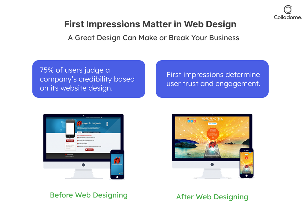
The internet doesn’t come with second chances. Within 0.05 seconds, your visitors decide if they like what they see or if they’re clicking away faster than you can say “bounce rate.”
- Fact Check: A whopping 75% of users judge your company’s credibility based purely on your web design. That’s right, your site is your reputation (Source: Sweor).
- Pro Insight: If your website looks like it’s stuck in 2010—or worse, it loads like a snail—prepare for the heartbreak of 38% of visitors abandoning it instantly. Ouch. Want to stay ahead? Embrace the best website practices of 2025: sleek, modern, and lightning-fast design.
2. User Experience = User Retention
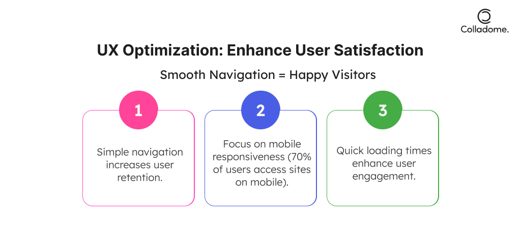
Here’s the secret sauce: a killer user experience isn’t a nice-to-have—it’s your golden ticket to keeping people hooked.
- Speed Matters: Fast-loading websites keep visitors happy, with a bounce rate as low as 9%, while slower sites are waving goodbye to nearly 38% of traffic.
- Mobile Domination: With 70% of web traffic now coming from mobile devices, ignoring mobile responsiveness is like throwing away customers. Want to dominate in 2025? Think responsive, intuitive, and ridiculously smooth.
- Expert Hack: Investing in seamless web design and functionality isn’t just good manners—it’s a business strategy to crush your competition.
3. Business Growth and ROI: Your Website Is a Profit Machine
Let’s talk numbers because nothing screams “important” louder than cold, hard ROI.
- Conversion Optimization: A well-designed, conversion-focused site can boost your sales by up to 400%. Yep, you read that right—400%.
- Visibility = Leads: A strong web presence doesn’t just look good—it drives qualified leads and elevates your brand visibility to levels you didn’t think were possible.
- Pro Tip: If your site isn’t optimized for conversions, you’re basically handing your customers to the competition. This is where partnering with the right web development company becomes non-negotiable.
The 2025 Playbook
In today’s digital-first world, mastering best practices for website development and design in 2025 isn’t just smart—it’s survival. From killer design tips to actionable strategies, this is your year to build a site that not only stands out but brings in the bucks. Looking for insights into website development: design tips and company strategies or wondering how to choose the best web development company for your website? Stick with us—your digital domination starts here.
What You Need to Know: The 2025 Blueprint for Website Development
Building a website in 2025 isn’t just about making it look pretty. It’s about creating a high-performing, customer-obsessed digital asset that stands out in a hyper-competitive online space. Let’s break down the best practices for website development and design in 2025, sprinkled with actionable insights and insider hacks to help you crush it.
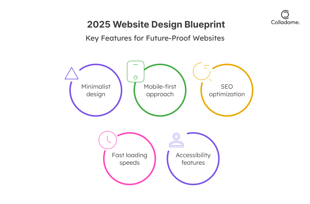
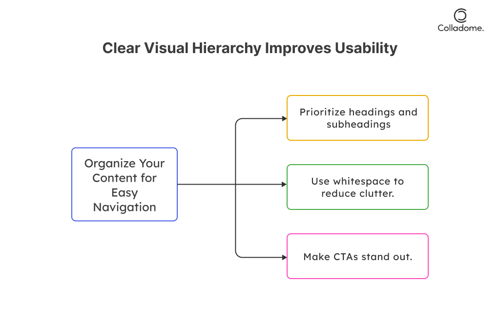
1. Minimalist Design and Functionality: Less is the New More
Forget clutter. The modern web thrives on sleek, simple, and user-first layouts that make navigation feel like second nature.
- Keep It Clean: Say goodbye to overcomplicated designs. Use white space, sharp visuals, and concise content to make your site easy on the eyes—and even easier to use.
- Visual Hierarchy = Success: Whether it’s bold headlines, strategic CTAs, or scroll-triggered animations, guide your visitors like a pro. They should know where to look and love what they see.
- Expert Hack: Combine killer web design with functionality that feels effortless. Think of your website as a digital concierge—friendly, efficient, and always on point.
2. Core Web Vitals: Google’s Golden Rulebook
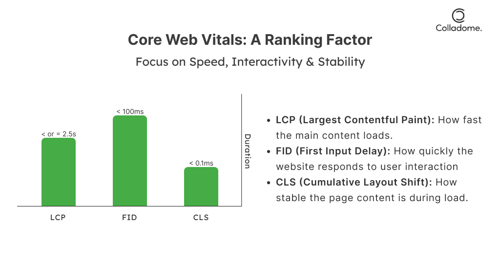
Want to rank high on Google and win over impatient users? Nailing Core Web Vitals is non-negotiable.
- Speed = Everything: Slow websites are so 2010. Prioritize blazing-fast page loads with lightweight coding and optimized images.
- Interactivity Matters: Your site shouldn’t just sit there—it should feel alive. Ensure clickable elements respond instantly.
- Visual Stability: Nobody likes layout shifts that make them accidentally click the wrong button. Keep your design rock-solid.
- Pro Insight: A solid handle on these metrics not only boosts your website development efforts but also skyrockets your SEO game. Google loves fast, functional, and flawless sites.
3. Mobile-First Approach: The Only Way Forward
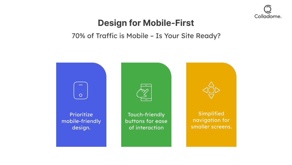
Here’s a shocker (not really): 70% of global web traffic is mobile. If your site isn’t mobile-optimized, you’re alienating the majority of your audience.
- Design for Thumbs, Not Mice: Prioritize responsive web design that works seamlessly across all devices, from tiny screens to massive monitors.
- Accelerate Everything: Implement Accelerated Mobile Pages (AMP) to make your site load like a dream, even on dodgy internet connections.
- Expert Takeaway: A web development company worth its salt will prioritize mobile-first strategies. If they don’t, run the other way.
4. Accessibility Compliance: Inclusivity Wins Every Time
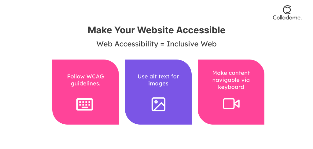
Want to make your website a true people magnet? Make it accessible to everyone. Following WCAG guidelines isn’t just ethical—it’s smart business.
- Alt Text is Your BFF: Ensure every image has descriptive text so screen readers can narrate them to visually impaired users.
- Subtitles and Navigation: Videos need captions, and your site needs keyboard-friendly navigation for those who can’t use a mouse.
- Pro Insight: Accessibility isn’t a trend—it’s a best practice for website development and design in 2025. Plus, it keeps you on the right side of compliance laws.
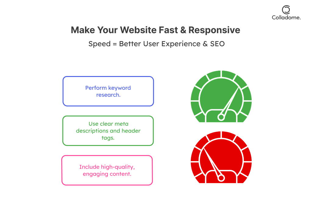
5. SEO-Driven Content: The King Still Rules
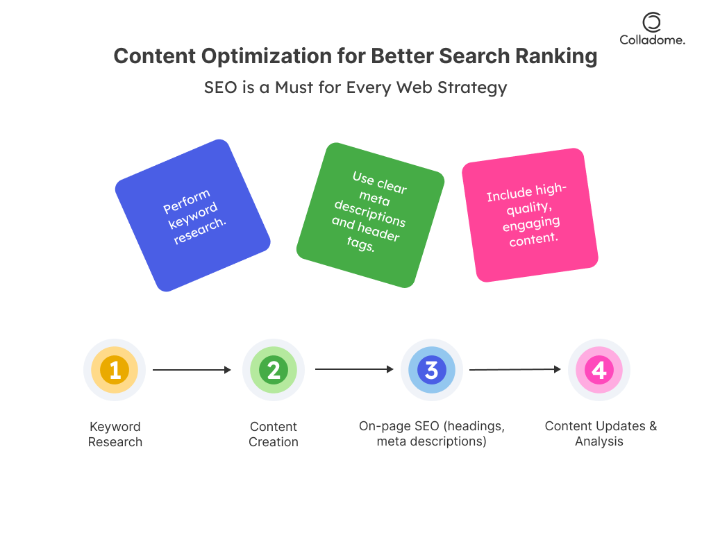
Good content isn’t just a bonus—it’s your ticket to higher rankings and more clicks. Your site should be bursting with SEO-driven content that serves both users and search engines.
- Keyword Optimization 101: Use smart, long-tail keywords like “Insights into website development: Design tips and company strategies” in your headers, meta tags, and alt text.
- Schema = Bonus Points: Implement structured data to make your content stand out in SERPs. Think rich snippets, FAQs, and all those eye-catching extras.
- Update or Die: Keep your blogs and landing pages fresh, relevant, and packed with value. Inactive content is basically invisible content.
- Expert Hack: Collaborate with a web development company that understands the balance between design and content strategy. They go hand in hand for business success.
| What’s Hot | Why It Rocks | Pro Move |
| Minimalist Design | Clean, sleek, no-nonsense vibes. | Cut the clutter, keep it killer. One CTA > Ten distractions. |
| Core Web Vitals | Speed + smoothness = Google love. | Compress images, kill heavy scripts, and watch your rankings soar. |
| Mobile-First | Designed for thumbs, not desktops. | Test on every phone. If it lags, fix it—pronto. |
| Accessibility Rules | Inclusive sites = happy users (and legal safety). | Add alt text, captions, and smooth keyboard navigation like a pro. |
| SEO-Driven Content | Keywords + value = Google domination. | No keyword stuffing! Write for humans first, search engines second. |
| Epic UX | Smooth, fun, and intuitive—no stress allowed. | Map out user journeys like a theme park. Every click should feel like a thrill ride. |
| Visual Hierarchy | Bold headlines, clear CTAs, and zero confusion. | Make your CTAs pop—big buttons, bold colors, no guessing games. |
| Conversion Machines | From clicks to cash—turning visitors into buyers. | A/B test like a maniac. Data beats gut feelings every time. |
How to Take These Insights and Crush It in 2025
Your website isn’t just an online address—it’s your digital powerhouse. Here’s how to turn these insights into action:
1. Build for Speed Like Your Business Depends on It (Because It Does)
- Why It Matters: A slow website is like a slow waiter—people walk away.
- How to Fix It: Compress those chunky images, enable lazy loading (so content loads as users scroll), and deploy a Content Delivery Network (CDN) to deliver your site faster, no matter where your users are.
- Expert Tip: Use Google PageSpeed Insights or GTmetrix to pinpoint speed killers and crush them.
2. Design Navigation So Smooth It’s Addictive
- Why It Matters: Confused users don’t stick around. Period.
- How to Fix It: Keep your primary navigation menu lean—5-7 items max. Got a lot going on? Add breadcrumb navigation to show users exactly where they are and how to go back.
- Pro Move: Test navigation labels with real users—call it “About Us” if that’s what they search for, not “Our Story.”
3. Fortify Your Castle: Cybersecurity Is Non-Negotiable
- Why It Matters: One breach, and your trust (and reputation) are toast.
- How to Fix It: Use HTTPS protocols, get a shiny SSL certificate, and implement Two-Factor Authentication (2FA) for admin areas. Schedule regular vulnerability scans because hackers don’t take holidays.
- Bonus Points: Use cybersecurity as a trust signal—display badges to reassure visitors their data is safe.
4. Content Is Still King—But Make It Wear the Crown Properly
- Why It Matters: Great content isn’t just helpful; it’s your 24/7 sales team.
- How to Nail It: Write for your audience, not just algorithms. Feature FAQs, real-world testimonials, and juicy case studies that show off your value. Regularly update your blog with insights they care about.
- SEO Win: Sprinkle in those keywords like magic dust: Best website practices, Web design, Website development, and more.
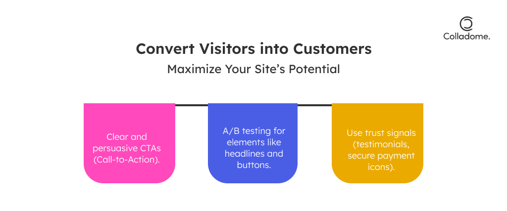
5. Turn Visitors into Buyers: Conversion Optimization 101
- Why It Matters: A pretty site with no conversions is just an online art gallery.
- How to Fix It: Add irresistible Call-to-Actions (CTAs) on every major page. Implement live chat features to instantly engage visitors. Include simple, accessible forms for leads to reach you.
- Pro Move: Use A/B testing to find out which layout, color, or wording drives conversions like a boss. Never guess—let the data decide.
Real-Time Examples
When it comes to website development and web design, these brands have mastered the art and science of crafting platforms that deliver top-notch user experiences and serious business growth. Let’s dive into their success stories and uncover the best website practices they’ve leveraged.
From India
1. Zomato: The King of Clicks and Cravings
- Why It Works: Zomato’s website is a perfect blend of simplicity and functionality. Their clean navigation, coupled with eye-catching imagery of dishes (that make you drool), keeps users hooked.
- Power Move: Their “Order Again” feature ensures users return without a second thought. It’s personalized, intuitive, and eliminates friction in the ordering process.
- Result: By putting user retention at the forefront, Zomato has cemented itself as one of India’s most user-friendly platforms.
2. Flipkart: Mobile-First, Festive-Ready
- Why It Works: Flipkart leads the charge in mobile-first design, catering to the 70%+ of Indian traffic coming from smartphones.
- Power Move: By emphasizing personalized recommendations, Flipkart makes every user feel like the platform was built just for them. Add to that their seamless festive sale experience, optimized for flash sales and mega events.
- Result: Flipkart consistently achieves 10x revenue growth during events like Big Billion Days, proving that smart design + personalization = profits.
From the World
3. Airbnb: Minimalist Magic Meets Machine Learning
- Why It Works: Airbnb’s website is the gold standard of minimalist web design—clean, intuitive, and laser-focused on the customer journey.
- Power Move: Their use of high-quality visuals (stunning property photos) and machine learning algorithms for personalized search results ensures users find their perfect stay, every time.
- Result: Airbnb dominates in user engagement and loyalty, transforming browsers into bookers with ease.
4. Amazon: The Master of Conversions
- Why It Works: Amazon’s website combines blazing-fast load speeds, seamless navigation, and the iconic one-click checkout, setting benchmarks for e-commerce everywhere.
- Power Move: Continuous A/B testing and hyper-personalization (think “People Who Bought This Also Bought…”) ensure Amazon never misses a chance to optimize conversions.
- Result: Amazon’s website isn’t just functional—it’s a conversion machine that drives billions in global revenue daily.
What You Can Learn From These Success Stories
- Best Practices in Action: These brands prove that website development and web design aren’t just about aesthetics—they’re about strategy, functionality, and results.
- Key Lessons: Focus on user retention, mobile-first strategies, personalization, and optimization for every user journey stage.
- The Competitive Edge: Want to be the Zomato or Amazon of your niche? Incorporate these insights into website development: design tips and company strategies tailored for your business.
Statistics
- Global E-commerce Revenue: E-commerce revenue is expected to reach $7.4 trillion by 2025. (source)
- Mobile-First Websites: Businesses adopting mobile-first strategies see a 67% higher conversion rate. (source)
- Voice Search Optimization: Voice search is expected to account for 50% of searches by 2025. (source)
- Core Web Vitals Impact: Websites that meet Google’s Core Web Vitals benchmarks experience 24% lower bounce rates. (source)
- Cybersecurity Statistics: Approximately 43% of cyberattacks target small businesses, underlining the importance of robust web security measures. (source)
Conclusion
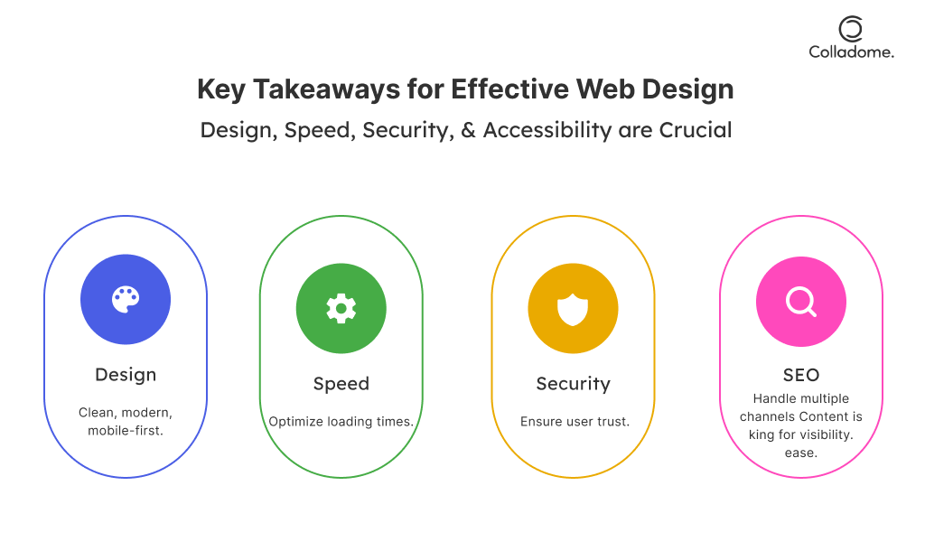
A successful website isn’t just about looking good; it’s about performing like a pro. Think of your website as your 24/7 digital salesperson—one that never takes a break. From lightning-fast load speeds to a seamless mobile experience, every detail matters. Accessibility isn’t just a feel-good feature—it’s a necessity. And don’t forget: your content should speak to your audience while your design guides them effortlessly.
The future is here, and your website is your handshake to the world. Whether you’re an emerging brand or an established player, staying ahead with best practices for website development and design in 2025 can make or break your digital footprint.
And when you’re scouting for partners, remember: the best web development company is one that doesn’t just build websites but builds growth-driven strategies.
Speaking of expertise, Colladome is the ally you didn’t know you needed. With a sharp focus on creating websites that combine stunning web design with user-first functionality, Colladome ensures your site isn’t just a destination but an experience. Whether you need tips, tricks, or full-scale insights into website development and design strategies, Colladome’s vision aligns with future-proofing your business.
Colladome believes in building websites that aren’t just beautiful but also work for you—from boosting visibility to driving conversions. Looking for the top website design and development best practices for business success? They’ve got your back.


6 Responses
Your article helped me a lot, is there any more related content? Thanks!
Your article helped me a lot, is there any more related content? Thanks!
Can you be more specific about the content of your article? After reading it, I still have some doubts. Hope you can help me. https://accounts.binance.info/pt-PT/register-person?ref=KDN7HDOR
Thank you for reading our blog! We’re glad you found it helpful. If you have any specific questions or suggestions, feel free to share them in the comments.
Thank you for reading our blog! We’re glad you found it helpful.
Thank you for reading and sharing your thoughts! We’re glad the article was helpful.